How to Design Team Shirts That Actually Look Professional
How do you design team shirts that actually look professional? Start with a clean, simple logo. Choose colors that complement rather than clash. Size and place your design properly. Skip the clip art and invest in quality artwork. These fundamentals separate sharp team apparel from shirts that look thrown together.
Whether you’re outfitting a corporate team, sports league, or volunteer group, professional-looking shirts make a strong impression.
Contents
Start With Your Logo
Your logo drives the entire design. A polished logo produces polished shirts. A weak logo drags everything down.
Keep it simple. Logos with too many elements, gradients, or tiny details don’t translate well to fabric. What looks great on a business card may become a muddy blob on a shirt. Simplify complex logos before printing.
Use vector files. Vector artwork (AI, EPS, or SVG formats) scales to any size without losing quality. Raster images (JPG, PNG) can pixelate when enlarged. If you only have a low-resolution logo, consider having it redrawn as a vector.
Limit your colors. Each color in screen printing requires a separate screen, adding cost and complexity. Most professional team shirts use 1 to 3 logo colors. This constraint often produces cleaner, more impactful designs.
Test readability at size. Print your logo at the actual size it will appear on the shirt. Can you read all the text? Do small details disappear? If anything looks unclear on paper, it will look worse on fabric.
Choose the Right Shirt Color
The shirt color affects everything about how your design appears.
Consider contrast first. Dark logos need light shirts. Light logos need dark shirts. A navy logo on a black shirt disappears. A white logo on a yellow shirt strains the eyes. Strong contrast makes your design pop.
Match your brand colors. If your company uses specific Pantone colors, find shirt colors that complement them. A red logo looks different on white, gray, and black shirts. Test combinations before committing to a large order.
Think about the setting. Where will people wear these shirts? Outdoor events favor lighter colors that stay cooler. Corporate settings often call for more subdued tones like navy, charcoal, or white. Sports teams can go bolder.
Account for printing limitations. Printing on dark shirts requires an underbase layer of white ink beneath your colors. This adds cost and slightly changes how colors appear. Printing on light shirts produces more vibrant results at lower cost.
Size Your Design Correctly
Nothing screams amateur like a logo that’s too big, too small, or awkwardly placed.
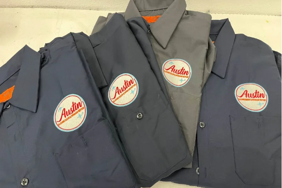
Standard left chest placement runs about 3.5 to 4 inches wide. This classic position works for most professional applications. It’s visible without being overwhelming.
Full front designs typically measure 10 to 12 inches wide, centered on the chest. Go too small and the design looks timid. Go too large and it overwhelms the shirt.
Back prints can run larger, often 12 to 14 inches wide. Center them between the shoulder blades, a few inches below the collar. Avoid printing so low that the design disappears when shirts are tucked in.
Sleeve prints work well at 3 to 4 inches. These secondary placements add visual interest without competing with main designs.
A custom print shop in Austin can show you mockups at different sizes before you commit, helping you visualize exactly how your design will look.
Avoid These Common Mistakes
Certain design choices instantly make team shirts look unprofessional.
Skip the clip art. Generic clip art screams low budget. Even if the image itself looks decent, everyone recognizes stock graphics. Invest in original artwork or work with a designer to create something unique.
Don’t use too many fonts. Stick to one or two typefaces maximum. Multiple fonts create visual chaos. Choose clean, readable fonts that reflect your team’s personality without sacrificing legibility.
Avoid trendy effects. Drop shadows, bevels, and 3D effects that look current today will date your shirts quickly. Classic, clean designs stay professional longer.
Watch your spacing. Elements crammed together look chaotic. Give your logo room to breathe. White space is your friend.
Don’t forget the back. If you’re printing on both sides, consider how the front and back relate. They should feel like parts of a cohesive design, not two unrelated graphics.
Pick the Right Shirt Style
The blank shirt matters as much as the design.
Match formality to purpose. Polo shirts convey professionalism for corporate teams. Athletic tees work for sports leagues. Standard cotton tees suit casual events and volunteer groups.
Consider your audience. Will everyone wear the same size range? Some brands run small. Others fit more generously. Order samples in multiple sizes before committing.
Think about fabric weight. Heavier shirts (5+ oz) feel more substantial and last longer. Lighter shirts (4 oz) breathe better in hot weather but may feel flimsy to some.
Evaluate quality tiers. Budget blanks like basic Gildan work fine for one-time events. Premium options like Bella Canvas or Next Level feel softer and fit better for shirts people will wear repeatedly.
Design for Your Specific Team
Different teams have different needs. Tailor your approach accordingly.
Corporate teams benefit from understated, professional designs. Left chest logos, company colors, and quality fabrics project competence. Avoid anything too casual or flashy.
Sports teams can push bolder with larger graphics, dynamic designs, and athletic fabrics. Numbers, player names, and sponsor logos add complexity but serve functional purposes.
Nonprofit and volunteer groups often need designs that communicate their mission quickly. Clear organization names and recognizable symbols help strangers understand who you represent.
Event teams may only wear shirts once, so budget matters more than longevity. Focus spending on design impact rather than premium blanks.
Work With Your Printer Early
Involving your printer during the design phase prevents problems later.
Share your budget upfront. Printers can suggest ways to achieve your vision within your price range. Maybe dropping one color saves enough to upgrade shirt quality.
Ask about print methods. Screen printing, DTG, embroidery, and heat transfer each have strengths and limitations. Your printer can recommend the best method for your specific design and quantity.
Request mockups. Seeing your design on a shirt template reveals issues you might miss looking at the logo alone. Most printers provide digital mockups before production.
Discuss timeline. Rush jobs limit your options and increase costs. Planning ahead gives you more choices and better pricing.
Consider These Professional Touches
Small details elevate team shirts from acceptable to impressive.
Add subtle secondary elements. A small website URL on the sleeve or a tagline on the back adds interest without cluttering the main design.
Use consistent branding. If your organization has brand guidelines, follow them. Consistent colors, fonts, and logo usage across all materials builds recognition. Your team shirts should reinforce the same brand identity you’re building across all customer touchpoints.
Think about packaging. For corporate gifts or retail sales, how shirts are presented matters. Folded with tissue paper in a box feels more premium than stuffed in a plastic bag.
Order extras. Nothing looks less professional than team members in mismatched shirts because you ran out of sizes. Order 10% to 15% more than your headcount.
Test Before You Commit
Before ordering hundreds of shirts, validate your design.
Order samples first. Most printers offer sample orders at slightly higher per-piece costs. Spending an extra $20 to see the actual printed shirt prevents expensive mistakes.
Get feedback from your team. Show the mockup to a few team members. Fresh eyes catch issues you’ve become blind to after staring at the design for hours.
Check in different lighting. Colors look different under fluorescent office lights versus outdoor sunlight. View your sample in the actual environment where shirts will be worn.
Wash and wear test. If durability matters, wash your sample several times. Does the print crack? Does the shirt shrink? Better to discover problems with one shirt than one hundred.
Bottom Line
Professional team shirts start with a clean, simple logo printed at the right size on a complementary shirt color. Avoid clip art, limit fonts, and skip trendy effects that date quickly. Match your shirt style to your team’s purpose and audience.
Work with your printer early, request mockups, and order samples before committing to large quantities. These extra steps take time but prevent disappointing results.
Great team shirts make your group look unified, competent, and put-together. They’re worth the effort to get right.

